“Greige” is that sweet spot between gray & beige, and it’s a paint color that’s both trendy and timeless. In fact, we’ve been on the greige bandwagon for nearly 20 years – well before we’d even heard that term! But finding the perfect greige can be daunting. There are 100s of neutral paint colors that could be considered greige, so we’ve waded through dozens of expert round-ups to see what colors come up over and over again. (Yes, I made a spreadsheet. And yes, I liked it).
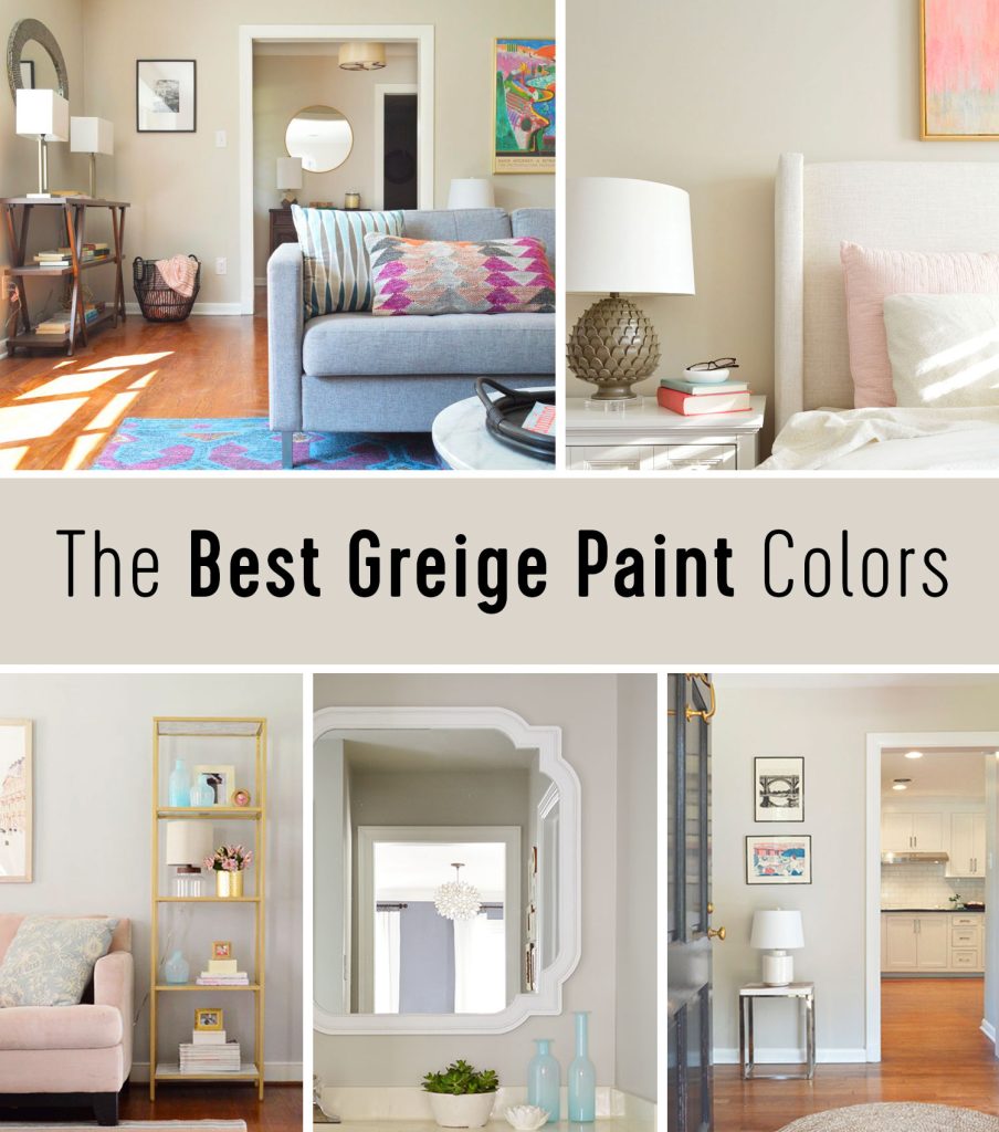

We weren’t surprised to see our favorite greige paint show up on this Iist, but the color that ranked #1 was a bit of a shock to us!
What Is Greige?
Greige is an umbrella term for any color that dances the line between gray and beige (gray + beige = greige). These paints might also be called “warm gray” or “cool beige” or just “the perfect neutral wall color.” For many homeowners, this category of color looks less dated & drab than beige, but more contemporary & cozy than gray. So basically, you get the best of both worlds!

Traditional cool gray paint colors seem to have fallen out of popularity lately because they can sometimes look sterile or cold. Likewise, beiges can skew too yellow or antique for some people. Greige paint colors dodge both of these pitfalls, which is why they’ve become so popular. They’re great options for walls, ceilings, cabinets, and even as a whole house color scheme. Heck, once we found a greige we loved, we gradually repainted nearly every room in our last house that color!
Pros of Using Greige Paint
Greige paints are a great choice for anyone seeking a versatile neutral color. Here are some reasons to consider it:
- You hate white walls but aren’t ready to commit to a color
- You’re trying to create a subtle contrast between white trim & your wall color
- You want a classic timeless color that doesn’t look dated
- You want something truly neutral that goes with warm & cool decor
- You’re looking for a soothing color to create a relaxing space
- You’ve considered gray walls, but worry it’ll be too cool or sterile
- You prefer a flexible backdrop for your constantly evolving decor & design style
- You’re paralyzed with paint indecision and need an easy and trusted option

Cons of Using Greige Paint
As much as we love greige, it’s not right for every person or every space. So here are some drawbacks to keep in mind before you paint:
- You want a bold or statement-making paint color
- Your room doesn’t get much natural light, which can skew greige into a darker beige territory
- You can’t stand being accused of “boring” design choices and want something risky
- Your furniture & decor is mostly greige itself, which can result in a flat look (monocromatic can also look great though! So it really depends)
That second to last one is probably the biggest criticism of greige paints – or any neutral wall color. Greiges have become especially popular among home builders, realtors, and even Airbnb hosts because they’re crowd-pleasers. But to some, this makes them too generic. Personally, we’d say don’t let that stop you from going greige if you want to! You’ll discover that your house will feel the most like “you” and the most welcoming to you when you follow your own instincts. And as you’ll see, there are plenty of reasons that greige can be a smart & stylish choice.
What Are The Best Greige Paint Colors?
Here are the 9 greige paint colors that get cited over and over AND OVER again. And yes, just like for our Best White Paints analysis, making a spreadsheet kept me organized. We’ve listed them starting with the one that appeared on nearly every list we reviewed. It’s a color we’ve used (and love!) but were surprised to see it float to the very top.
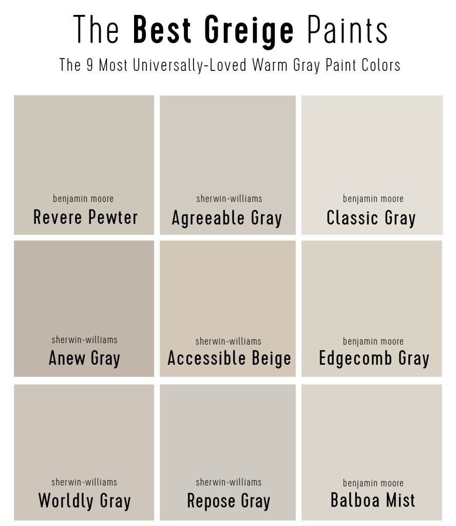

Note: The swatches in this post are taken directly from each paint manufacturer’s website. These are imperfect digital approximations of each paint color, but they are the best apples-to-apples way to discuss paint online. We encourage you to view physical swatches of any color before painting.
How To Pick The Perfect Greige
Finding the perfect greige for your space can still be tough, even from this narrow list. The nuances between two colors can often be very (and maddeningly) subtle. To help distinguish them, we’ll talk a lot about brightness and undertone. These are useful terms to keep in mind when picking any color, but especially grays.
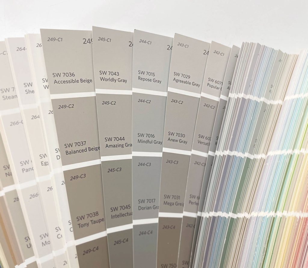

We also recommend viewing and testing paint colors in person before making a final selection. Screen colors are not true-to-life, so we’ve included links for pre-painted removable stickers for each color too (those are all listed & linked further down in this post). Large stick-on color swatches are a great way to evaluate the true color without breaking out a paintbrush! Plus you can try them in multiple spots at different times of day to see how they change.
What is LRV?
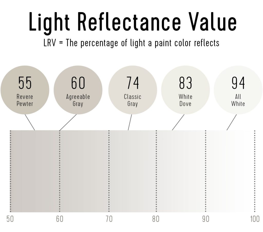
LRV (Light Reflectance Value) is a standardized way to measure how bright a paint color is. It’s represented by a number from 0 to 100, indicating the percentage of light that a painted surface reflects. The higher the number, the brighter the paint (100 = pure white, 0 = true black). You can see the LRV for a range of popular colors below:

Now let’s look at where the 9 best greige paints fall on an LRV scale. You can see that there is quite a range: SW Anew Gray is the darkest (with an LRV of 47). And SW Classic Gray is the lightest (with an LRV of 74). Most of them cluster around an LRV of about 60.
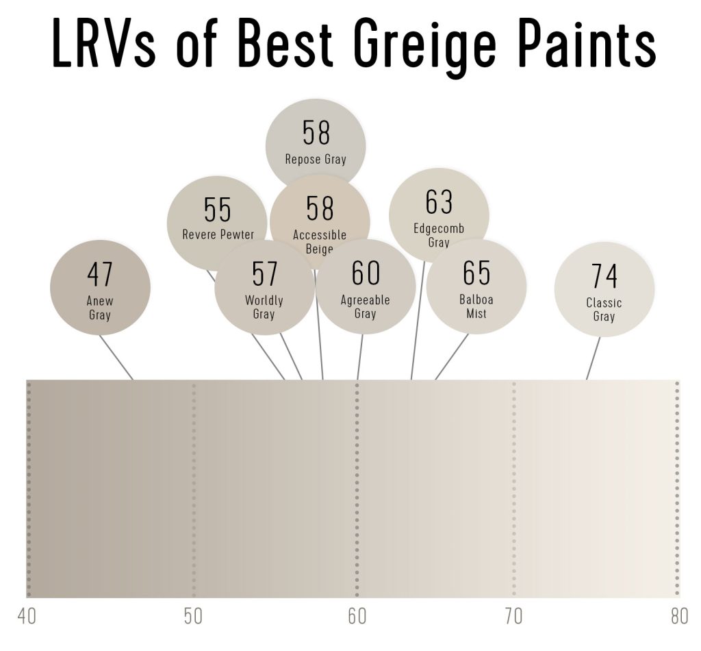

You can typically find a paint color’s LRV scale on the manufacturer’s website. They can be helpful to know when you’re comparing two colors, or while seeking alternative options of a similar brightness. Knowing a paint color’s LRV is also useful with white and gray tones because these swatches aren’t always displayed according to brightness like other colors in a paint deck.
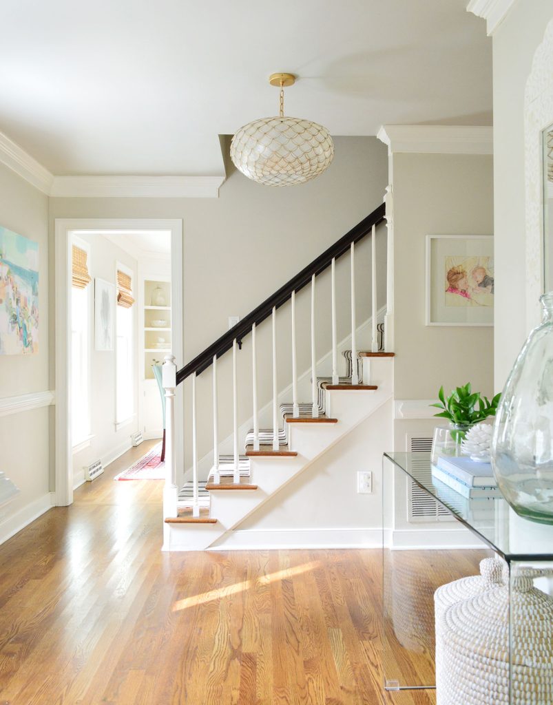

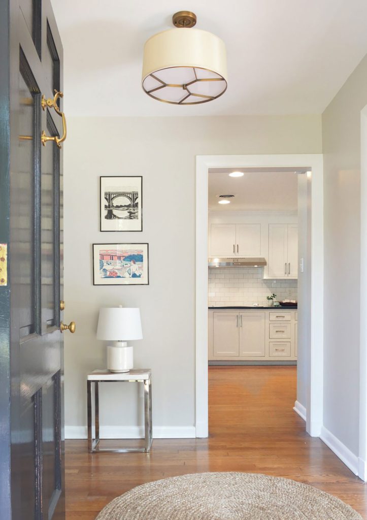
LRV can also help you pair two greiges together. For instance, we wanted to paint a complimentary, but deeper greige on the ceiling of our foyer. The walls were already BM Edgecomb Gray (with an LRV of 63) so we went with BM Revere Pewter (with an LRV of 55) on the ceiling. In person it was clear to see that the ceiling was slightly darker and a bit more moody.
What Are Undertones?
Undertones refer to the subtle secondary colors in most paints. They’re typically grouped in terms of warm vs cool. For instance, a warm gray may have hints of yellow or red. A cool gray might look more blue or purple. These are often difficult to detect, especially on small swatches. They’re also somewhat subjective and are influenced by other factors in a room like lighting, nearby colors, and wood tones.
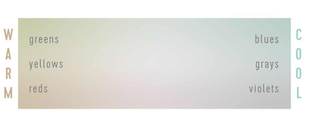

By definition, “greiges” fall on the warmer side of the undertone spectrum, but not so far that they get called cream, ivory, beige, or tan. Most greiges on this list gained popularity because their undertones are extremely subtle – meaning they truly walk the line between gray and beige. Still, it’s important to understand them so you’re not surprised when it goes up on your wall.
How To Test Greige Paint Colors
It’s always wise to test paint colors before you finalize your decision. No matter how highly recommended a paint color is, it’s ultimately up to how it looks to YOUR eyes in YOUR space.
Gather LOTS of swatches. You’re eager to narrow your choices, I get it. But collecting extra swatches – even for colors that are darker, lighter, warmer, or cooler than you want – helps you better identify any differences in brightness or undertone. You also may surprise yourself and realize you wanted something warmer or cooler or darker or brighter than you originally thought!
Stick, don’t paint. Once you’ve narrowed your options, use a site like Samplize to order large pre-painted stickers of your favorites. They’re about the same price as sample paint pots, but don’t require any painting (or repainting when you’re done!). They simply peel off! This also makes them great for moving around to different surfaces in the room so you can see the color on different walls in different lighting scenarios. Here are links to the 9 greiges on this list:
Give your samples time. Observe your stickers during the morning, afternoon, evening, and in artificial and natural light to evaluate how the brightness and undertone may change. Try them on different walls in a room too. They can also be stuck to cabinets, trim, or other surfaces you’re considering painting.
The 9 Best Greige Paints
Now that you understand a bit about evaluating greige paint colors, let’s take a closer look at each of the ones that made this list. We scoured many lists from color experts at Southern Living, House Beautiful, Elle Decor, and even Bob Vila. We also referenced fellow bloggers and crowd-sourced forums like Houzz and Reddit. We’ll start with the most often-cited greige:
#2. Sherwin Williams Agreeable Gray
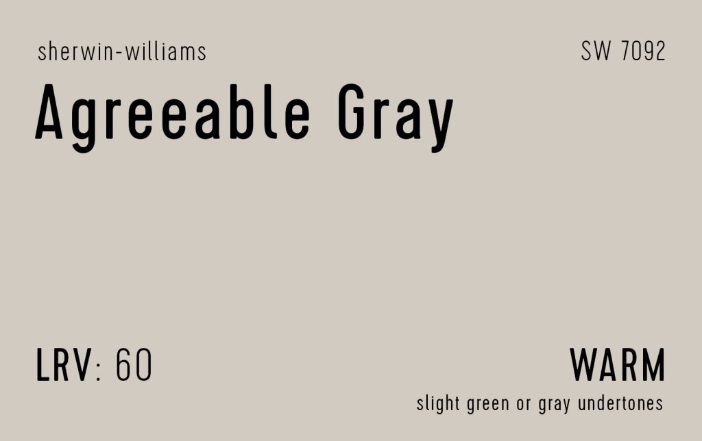

Agreeable Gray (SW 7092) is one of Sherwin-Williams bestselling colors for many of the same reasons that Revere Pewter is for Ben Moore. It has an LRV of 60, which makes it slightly lighter than Revere Pewter’s 55. It’s also a hair cooler, meaning in some lighting situations it can veer a little closer to gray than greige. As you can see in the room below, it definitely doesn’t look like pure cool gray though – it still has that warmth to balance it.
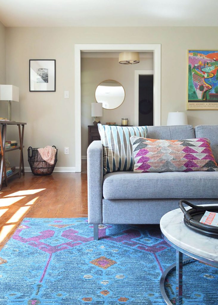

Like its name says, Agreeable Gray is a great team player and looks good with a variety of design styles and color schemes. Our friends used it when renovating their rental (above) because its a classic backdrop for their colorful furnishings and accessories.
#3. Benjamin Moore Classic Gray
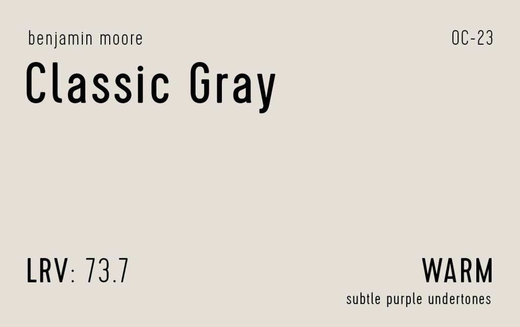

Benjamin Moore’s Classic Gray (OC-23) is the lightest greige on this list, so it’s a great choice for darker rooms or areas where you want less contrast with white trim. Just be warned that without a lighter color nearby, Classic Gray may look nearly white itself! But the barely-there undertones that it has (sometimes described as purple or green) make it a super versitile warm gray.
#4. Sherwin-Williams Anew Gray
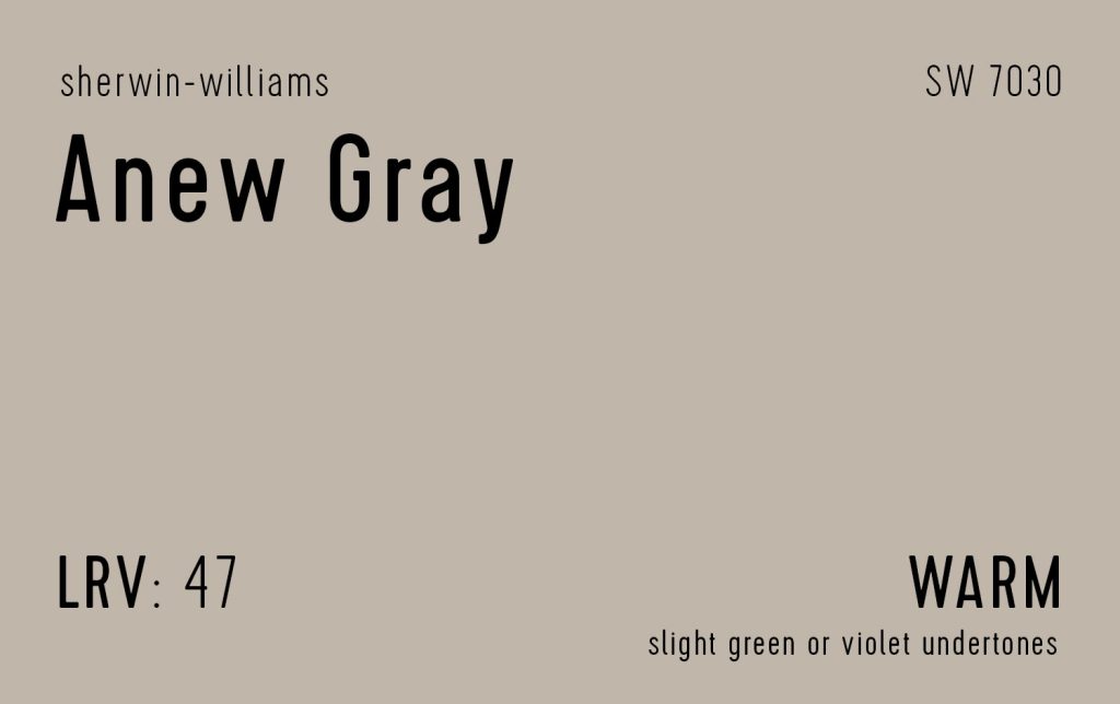

On the opposite end of the spectrum, Sherwin-Williams’ Anew Gray (SW 7030) is the darkest greige on this list. It’s actually on the same swatch as #2 on this list: Agreeable Gray, just one shade darker. Like most others on this list, the subtle undertones tend to read as green or purple. This gives it a warm, almost stone-like appearance. Consider Anew Gray for bright rooms where lighter greiges may wash out, or in darker spaces where you want to create a cozy, den-like feel.
#5. Sherwin-Williams Accessible Beige
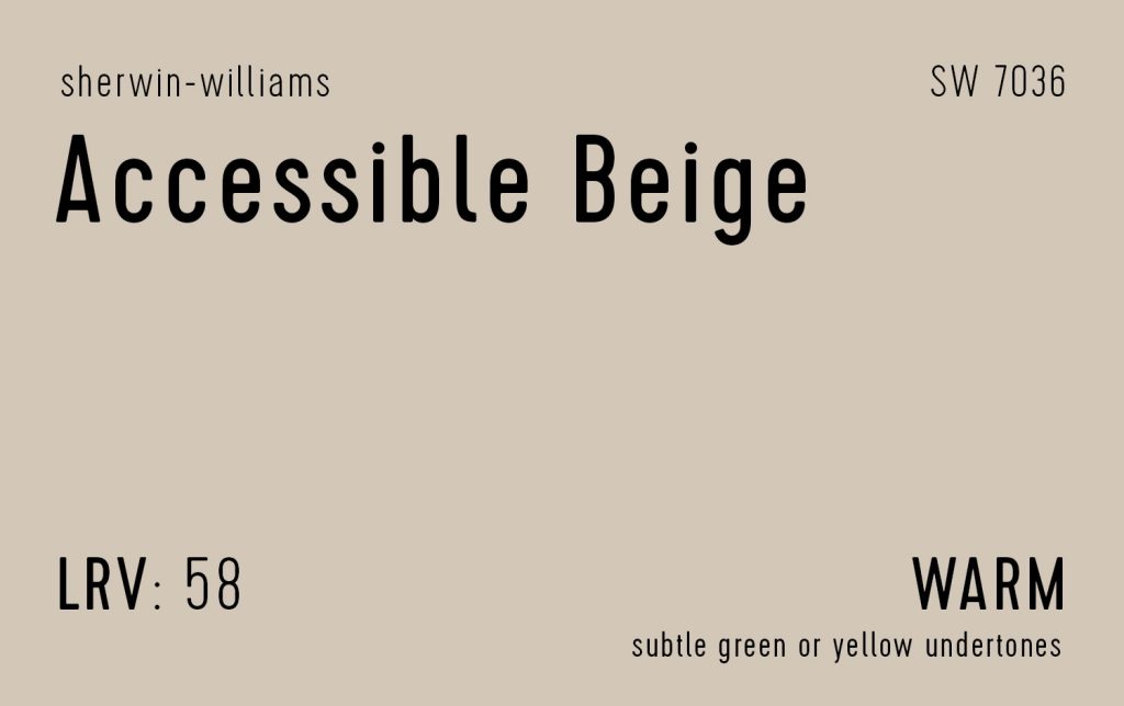

Like Agreeable Gray, Accessible Beige (SW 7036) is another one of Sherwin-Williams’ top-selling colors of all time. With an LRV of 58, it hits that 60-ish sweet spot that most colors on this list fall into. As its name implies, this color tends to skew a little closer to beige in some spaces. It is probably the warmest color on this list (and in a room without much natural light it’ll likely look even darker & warmer). So if you’re finding these other colors too cool or gray for your liking, or you’re trying to achieve a cozier sunny look, try Accessible Beige.
#6. Benjamin Moore Edgecomb Gray
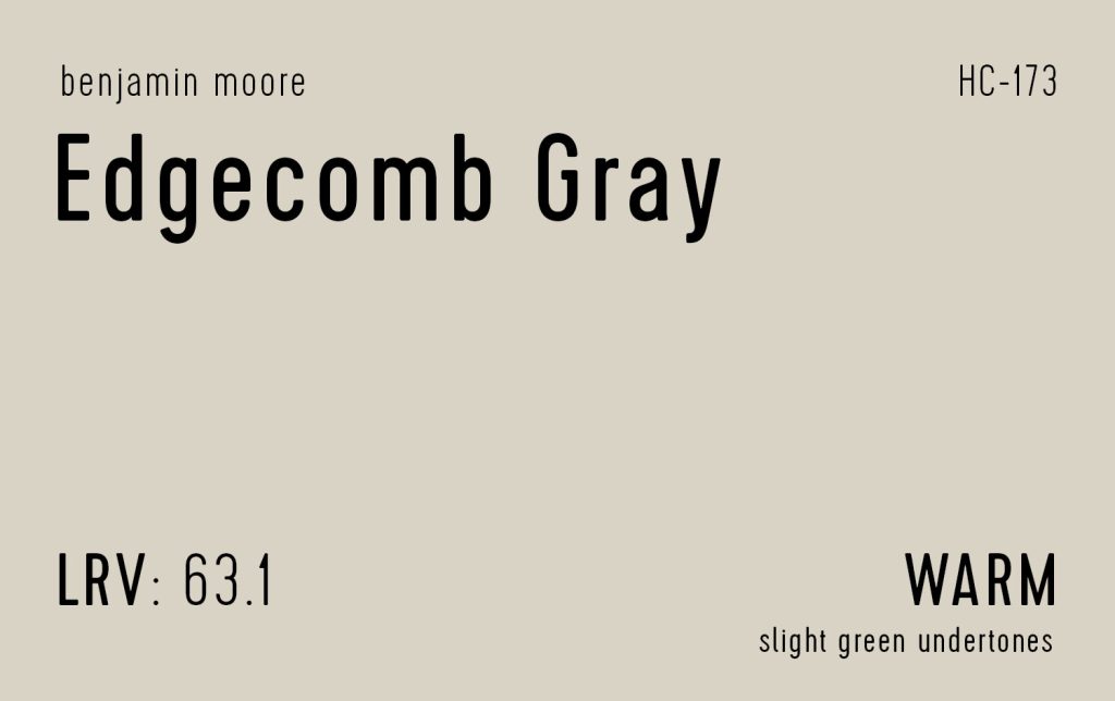

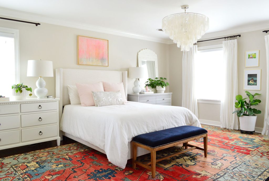
Edgecomb Gray (HC-173) is our hands-down favorite go-to greige. We even wrote a whole deep dive about why! It’s another one of Benjamin Moore’s bestselling paint colors and actually sits on the same swatch as Revere Pewter, just one shade lighter (it has an LRV of 63 vs. Revere Pewter’s 55).
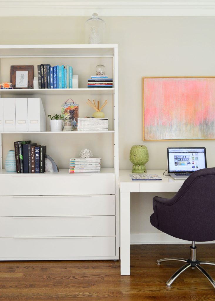

We first tried it out in our old bedroom (pictured at the top of this post) and loved it so much that we slowly repainted nearly half of our house Edgecomb Gray. Our dining room, office, hallway, foyer, and powder room were ALL EDGECOMB GRAY. You can see more photos of it in our Edgecomb Gray review. We like that it perfectly straddles that gray / beige line, while being a bit lighter and brighter than Revere Pewter.
#7. Sherwin-Williams Worldly Gray
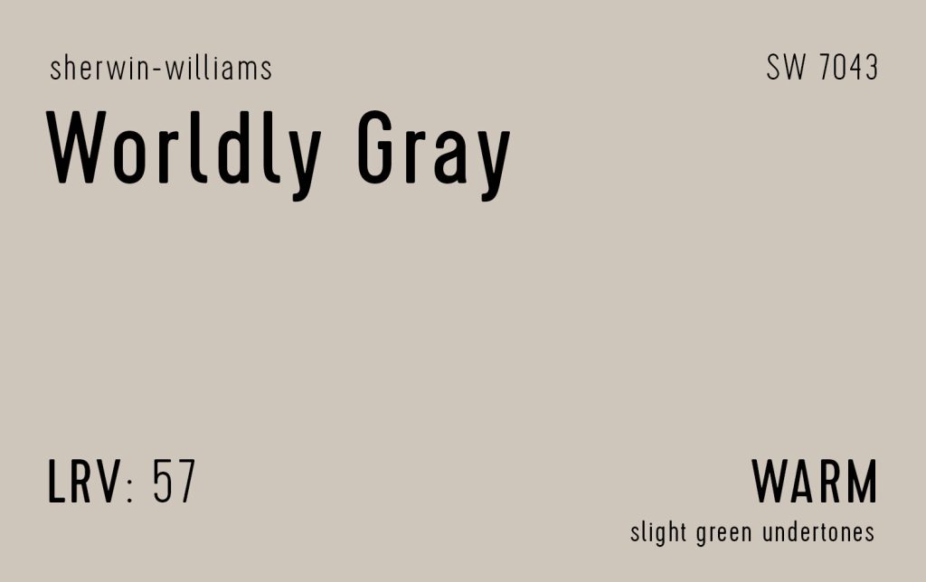

Wordly Gray (SW 7043) is very similar to BM Revere Pewter, although just a hair lighter and cooler. When viewed side-by-side, Revere Pewter may look a bit browner, so Worldly Gray is a great option if you want to stay firmly on the “gray” side of things. Although we haven’t used Worldly Gray ourselves, we used a darker color on the same swatch (Anonymous SW 7046) on our old siding for a beautiful deep putty color.
#8. Sherwin-Williams Repose Gray
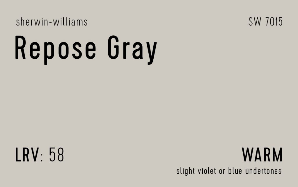

Repose Gray (SW 7105) is the coolest of the colors on this list, although it’s still warm enough to classify as a greige in most spaces. We helped friends of ours select Repose Gray for the entire first floor of their house a few years ago. In our experience, it changed a lot depending on lighting and trim color. In their sunnier south-facing rooms it was firmly greige. In their north-facing rooms (like their living room below) it skewed grayer. It was really beautiful either way and basically went with every furniture item.
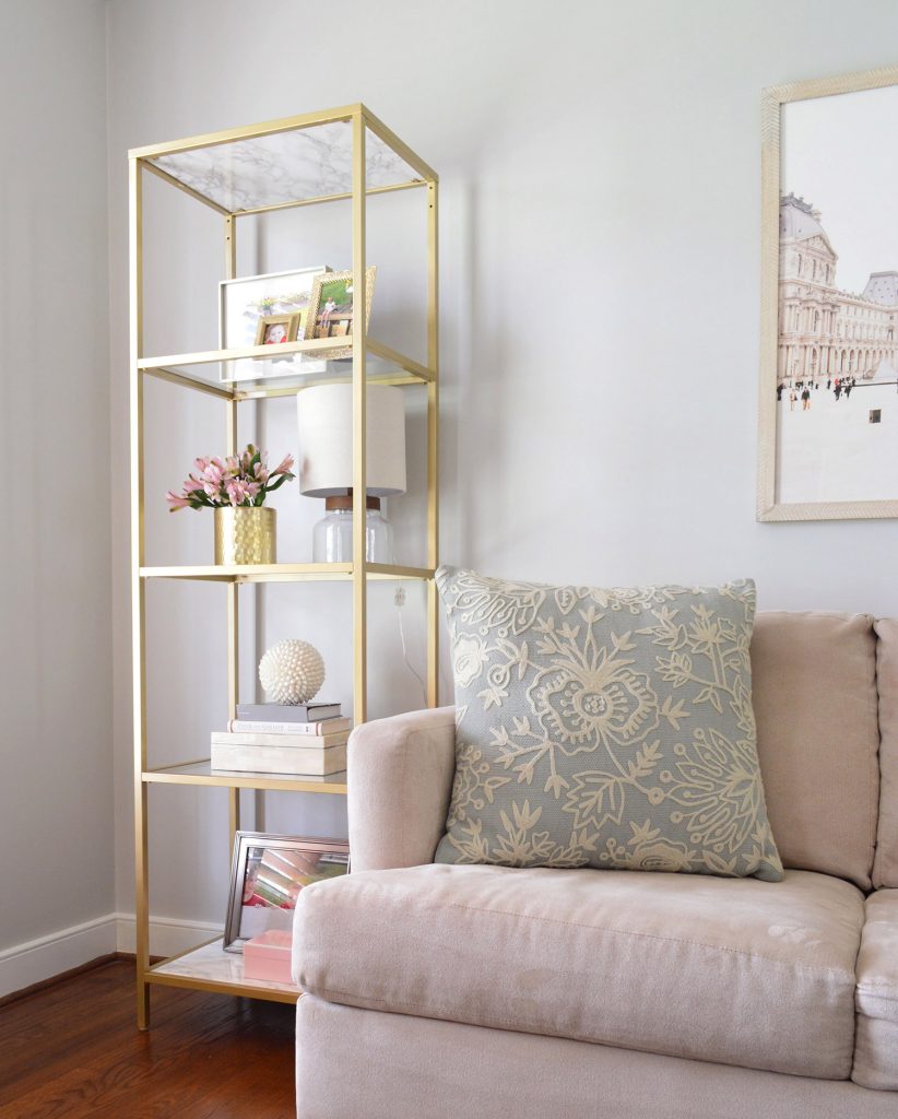

You can also see Repose Gray in their kids’ homework room. That’s another north-facing room and it also had a lot of cool white and blue accessories, causing it to look less greige.
#9. Benjamin Moore Balboa Mist
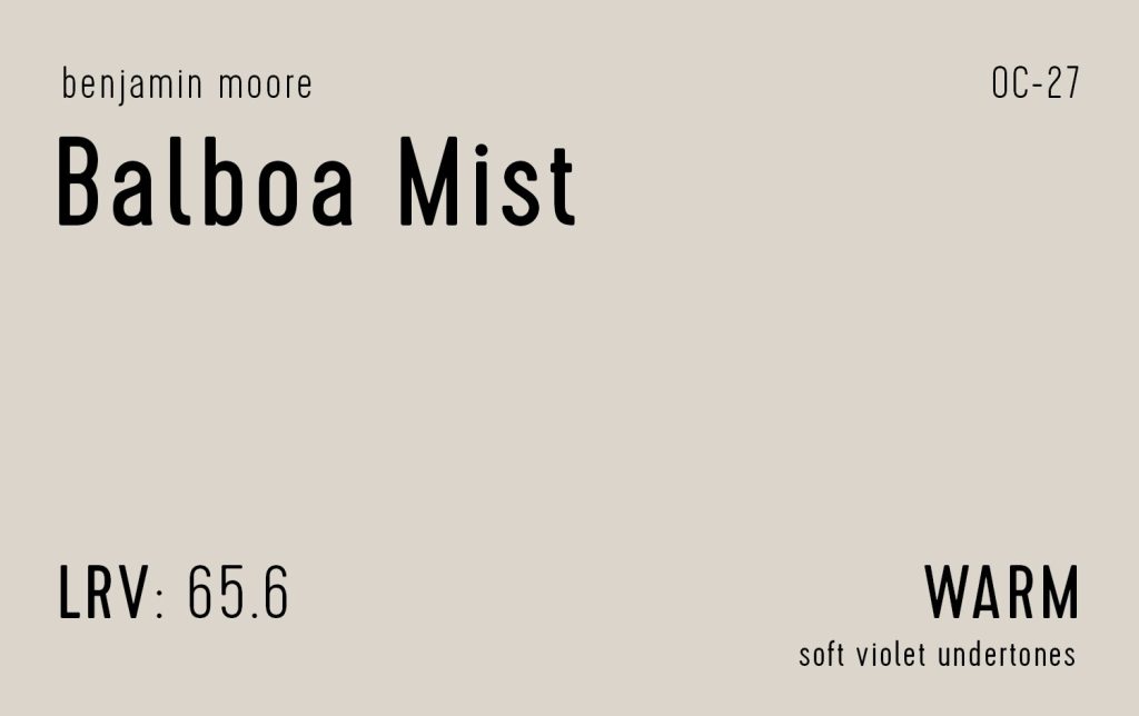

Benjamin Moore’s Balboa Mist (OC-27) is the 2nd lightest greige on this list with an LRV of 65 (Classic Gray is the lightest at 74). We considered Balboa Mist over Edgecomb Gray for our home and I think we would’ve been very happy with either. It is a smidge cooler too, so it could be a good alternative if you worry Edgecomb Gray is too beige for your liking.
Runner-Up Greige Paint Colors
Here are 8 other popular greige paint colors that appeared across multiple lists we reviewed. They weren’t cited quite as often as the Top 9 above, but many designers still swear by them. You see from the grid below that they run a wider range of shades and undertones.
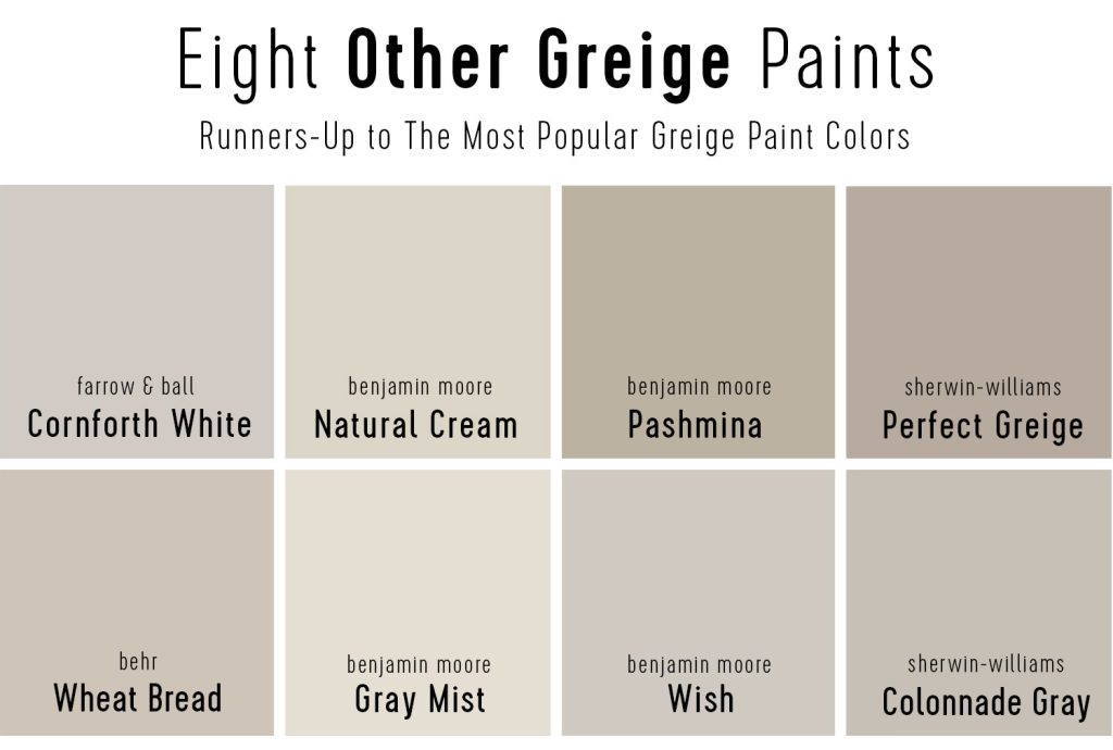

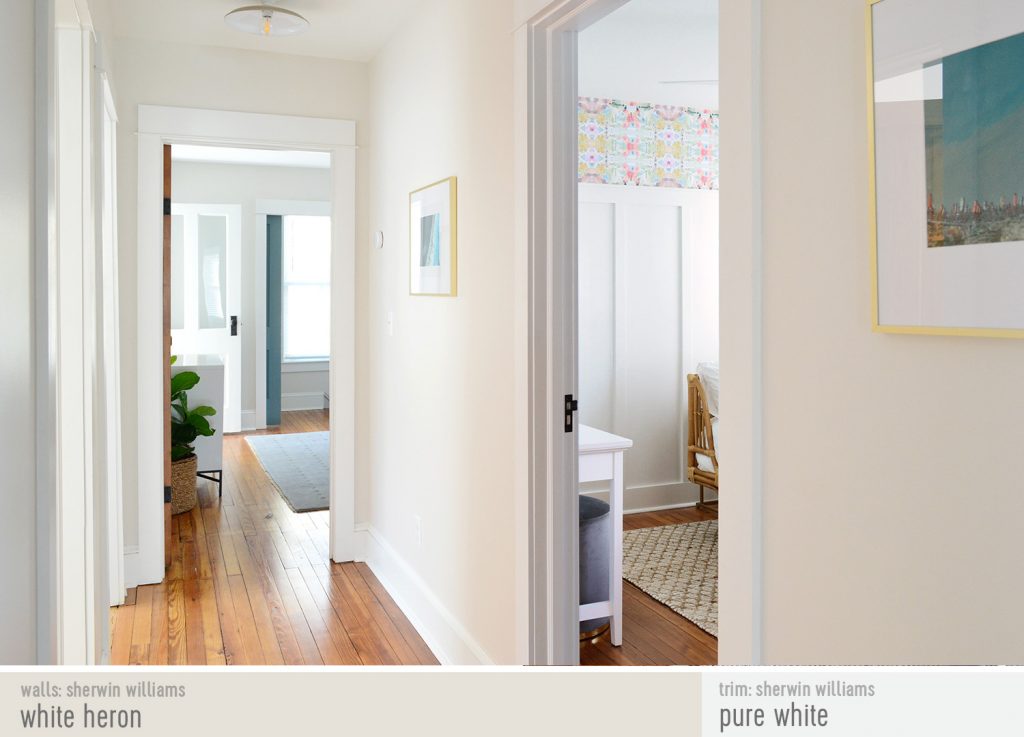
We have also personally used Sherwin Williams White Heron (SW 7627) with great success, which is a lesser known color similar to Gray Mist above. It’s very subtle and light and beautiful (it was on every wall of our beach house).

Other Greige Paint Color FAQs

What trim color goes best with greige walls?
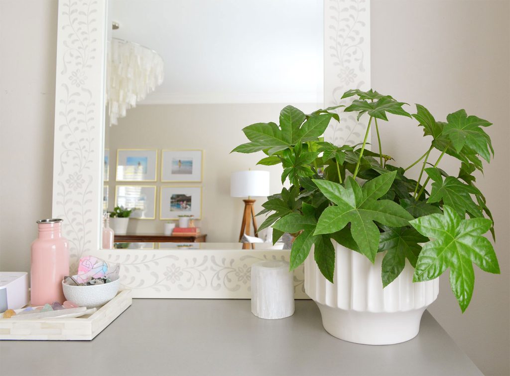
White trim is always a classic choice with greige walls. This keeps the color from skewing too beige or too gray, which could happen with off-white trim. You can paint the same greige on your trim for a tone-on-tone look, but without the contrast of white trim you may lose some of the greige color’s beauty. Some of our favorite white trim colors are BM Simply White, SW Pure White, and SW Extra White.
What ceiling color goes best with greige walls?
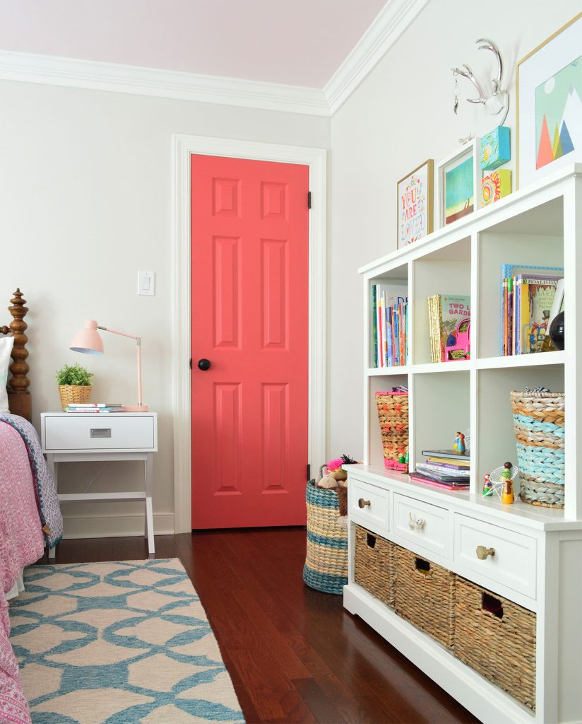
Greige walls work well with white ceilings, but can also be paired with other colors – including the same greige you used on the walls. We paired Edgecomb Gray walls with Revere Pewter ceilings in our old foyer. They’re on the same swatch, meaning we knew they’d work well together. In our daughter’s old room we did a more playful pink ceiling. Just test the colors first to be sure their undertones don’t clash.

Is greige still popular in 2024?
Greige paints are a timeless choice that won’t be going out of style anytime soon. One paint brand even picked “Rustic Greige” as their 2023 Color of the Year! Greiges have been popular for a very long time, so they may feel less trendy or cutting-edge than other colors that are having a moment.
What color is replacing greige?
In 2024, some experts are predicting the return of warmer beiges, yellows, and creams. Glidden even selected one for their 2024 Color of The Year. This is likely a continuation of the trend away from the cool grays that dominated in the early 2010s. However, greiges are well-poised to outlast this fluctuation between warm and cool neutrals because they sit firmly in the middle.
What’s the difference between greige and taupe?
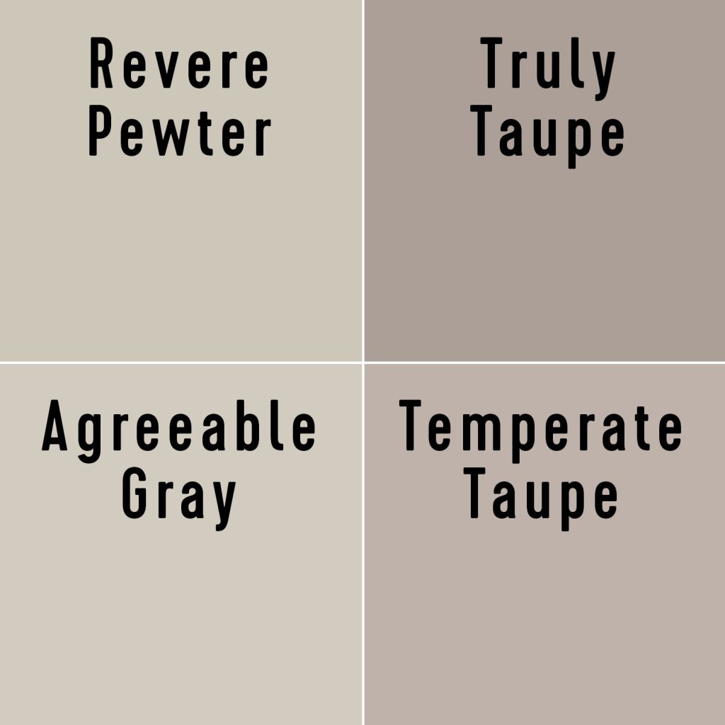
Greige and taupe both refer to colors that are a mix of gray and beige, and the terms are often used interchangably. However they are technically a bit different. Greiges tend to favor green undertones, while taupes often have noticable pink or purple undertones. In fact, Sherwin-Williams’ 2017 Color of the Year, Poised Taupe (SW 6039) is classifed as a purple in their database!

Where should I use greige?
Greige paints are great on nearly every surface: walls, cabinets, ceilings, or even trim and doors. Greiges are also great choices for exterior siding. Just be sure to choose a darker greige for outside because colors tend to wash out in the bright sunlight. So a medium greige inside can literally look almost white outside in all that sun.
More Paint Colors We Love
You can check out more of our favorite go-to paint colors by touring our homes in the menu at the top of our blog. We’ve also written these detailed deep-dive posts about our favorite paint colors:
*This post contains affiliate links, so we may earn a small commission when you make a purchase through links on our site at no additional cost to you.


